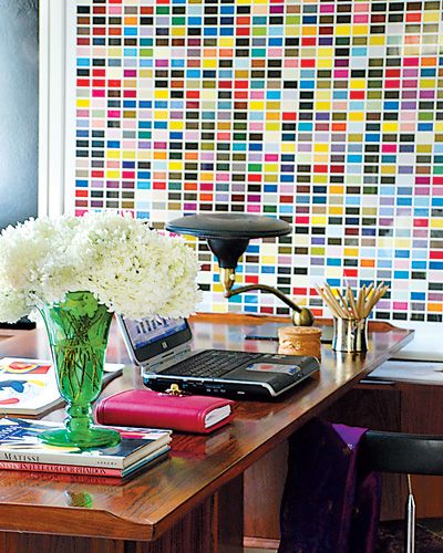
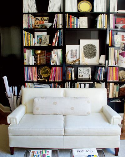
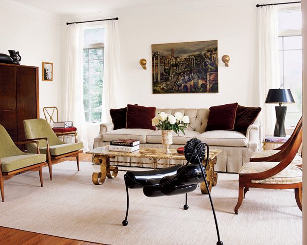
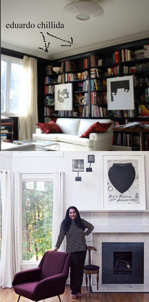
It all started out because I loved the above print by Gerhard Richter’s “1025 Farben”. I loved how it added color to the black-walled combination library and home office . Raja Radhakrishnan is the woman who designed the above space and she had no formal interior design training but relied upon her own innate sense of aesthetics and composition. I can tell that she has a love of art and design because she has some fabulous pieces of art hanging around her space. On her site I even noticed a pair of Eduardo Chilida pieces.
{images via Metropolitan Home}
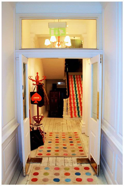
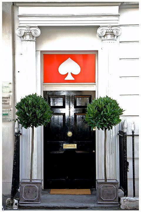
The above art reminds me of the new Kate Spade store in London. Packed full of colors.

No comments:
Post a Comment