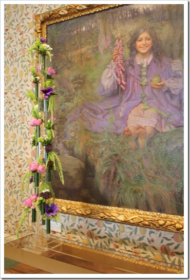
This year Meade Design Group have been very fortunate to be invited by the Art Gallery of Greater Victoria to reinterpret an art piece of their permanent collection in a botanical extravaganza as part of their annual exhibition Art in Bloom.
Leading creative professionals in the field of design were selected to celebrate spring creating unique floral interpretations. We were assigned a stunning oil painting in canvas by Theresa Victoria Wylde (circa 1909) entitled “This Is The World, And I Am King…” (127” height X 137.5 width). Our interpreted title for the exhibit is “Design Fit For A King”.
Description
The central figure is a young girl with long wavy black hair who wears a purple gingham dress with a purple over-dress; she is sitting in a forest by a stream, holding an apple(orb) in one hand & a foxglove(septre)in the other; she has a 'crown' of evergreen boughs with cones in her hair; a squirrel sits nearby, watching her.
- Art Gallery of Greater Victoria
We were inspired by the description of the painting and we also wanted to display all our strengths as a multidisciplinary design studio. We designed 3 pieces for the installation. The first idea that came to my mind when I saw the piece was “ethereal” – I wanted to create an installation that was light and complemented the painting.
The first piece we designed was a massive Plexiglas cube to encase the antique chest that was below the painting. As an interior designer I felt that the scale of the chest was not big enough to hold the visual weight of the painting, so we corrected the proportions and the scale of the chest with a new Plexiglas structure making the chest look like an archived piece. We also incorporated a modern interpretation of some of the elements of the painting with contemporary graphics. Our design complemented the William Morris wall paper showcasing our strengths in Graphic Design. Natashita brought to life our ideas choosing an opalescent metallic vinyl that complemented the colour scheme of its surroundings.
The second piece we designed was a Plexiglas plinth that mimic the proportions of the chest. We cover the face of the plinth with the same vinyl we used in the cube below to continue the flow. As for the 3rd piece we designed the flower vase which references the foxglove flower in the painting.
Artist Statement
We were inspired by the strong vertical line created by the foxgloves held by the girl in this painting. We wanted an organic, linear form to overlap the painting asymmetrically to create a strong, contemporary vignette that still works with this traditional piece.
We used a combination of anemones, tube roses, double tulips, mosses and greens accented by drumstick alliums and fuchsia trachelium. We wanted to build up a woodland feeling with berries, mosses and greens, but still have interesting forms and textures with more exotic accents. This is reinforced by the golden graphic that has been applied to the acrylic base which encases the trunk.
Mini Flower Bouquets
Here is Echito our flower arranger extraordinaire.
Adjusting last minute details.
And here it is the complete installation.
“Design Fit For A King”
We want to extend our gratitude to Plexiklass, Rook and Rose, Brenda Marks – Kravet, and Garside Signs and Displays for all their help, patience and guidance to make this project come together.
If you are in Victoria don’t miss the hottest ticket in town!
Art in Bloom 2011 - a week long celebration of fine art and all things botanical. The bi-annual fundraiser heralds the beginning of spring to Vancouver Island, and supports exhibitions and programming at the Art Gallery of Greater Victoria. Art in Bloom highlights the talents of local and international artists, writers, floral designers and garden experts.


No comments:
Post a Comment