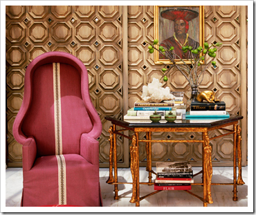
Wood panelling can be a very effective architectural element in adding instant appeal and memorability to a room. I have to say that even If I really like wood panelling I am not fond of the 70’s cedar wall panelling you can see far too often in homes here on the West Coast. That’s just wood on the wall. However, in the hands of a skilled designer or architect the results can be outstanding.
Here are some examples of my favourite contemporary uses of wood panelling and that clearly reflect the designers point of view and aesthetic.
I love the use of the round window as a focal point and the mix of a large flat panel and the grid panels next to it. It definitely adds warmth and interest to the room, creating a solid background for the rest of the elements.
The panelling in this dining room is asymmetrical, but does not overwhelm the space as it has been painted the same colour as the wall. I also love how the light fixture relates to the panels at the right side and center with the lower panels..
This is one of my favourite wall panelling's applications I have seen – It follows the curve of the wall playing off the traditional crown mouldings against the modern vibe of the symmetry and creates a very interesting juxtaposition. It is classic yet is contemporary.
Via Thad Hayes
The panelling in this room is very quiet – It reinforces the focal point in the room and as you can see the panelling doesn’t go wall to wall which gives the room added depth and dimension.
This wall panelling creates a resonance and a sense of rhythm that makes the space feel comfortable. It is an excellent backdrop for the beautiful collection of French furnishings and sculptures. The panelling also gives the room ‘permission’ to not fill every wall with art, the panelling is art in itself.
Via William Sofield
This is an example where luxury and elegance can be found in one image at Tom Fords NY boutique. With strong references of the Art Deco era but with contemporary design in mind, this ebony panelling is simply epic.
Via Kelly Wearstler
For all my Westies, this is a wall panelling at an angle. This panelling in bleach walnut is sophisticated and a great backdrop for the art collection.
Via Barbara Barry
God is in the attention to detail. The back panelling adds dimension and almost a contrast texture to the furnishings. It is very soft and enduring – I just want to sit in that room and enjoy myself.
Via Orlando Díaz-Azcuy
A great solution for a free standing wall – The effect of this wall panelling adds presence to the room. It is the only strong colour in the room which makes it perfect as a focal point. This paneling also resonates with the ceiling beams reinforcing symmetry with the fireplace and asymmetry in the room. There is an extra panel in the left side – Did you notice that?
Via Kelly Wearstler
A contemporary interpretation of the traditional panelling is something you can see in any Château. The geometric elements of the panelling add the architectural voice to the room that otherwise would be unclear. This panelling is the warm and defining backdrop for the eccentric collection of furnishings and art.


No comments:
Post a Comment